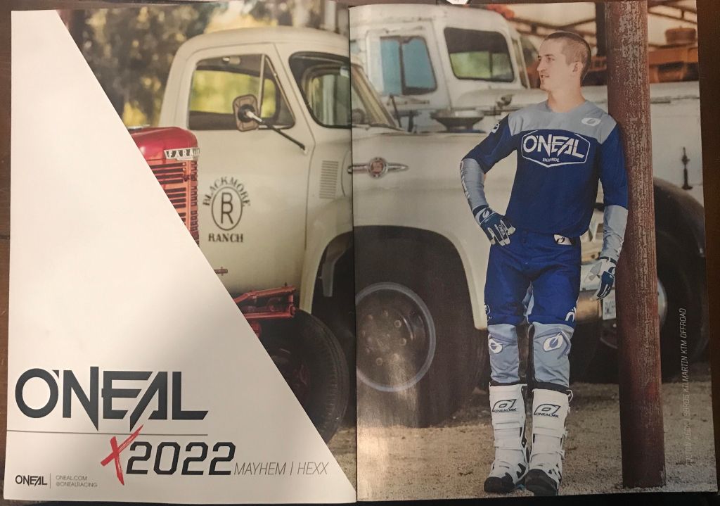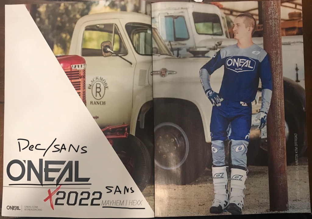
An O’Neal advertisement for motocross equipment. From Motocross Action magazine, November 2021. Picture taken by Colton Aeck.
The design is simple and shows off the look or “coolness” factor of buying and wear gear from O’Neal.
Type Face

The type here is in two styles. The bigger type, the logo, seems to be a decorative style. Its sharp and have funny angles you normally would see in most type.
The other types are sans serif. The 2022 is thicker and the Mayhem/Hexx as well as the website and instagram tag are light and thin.
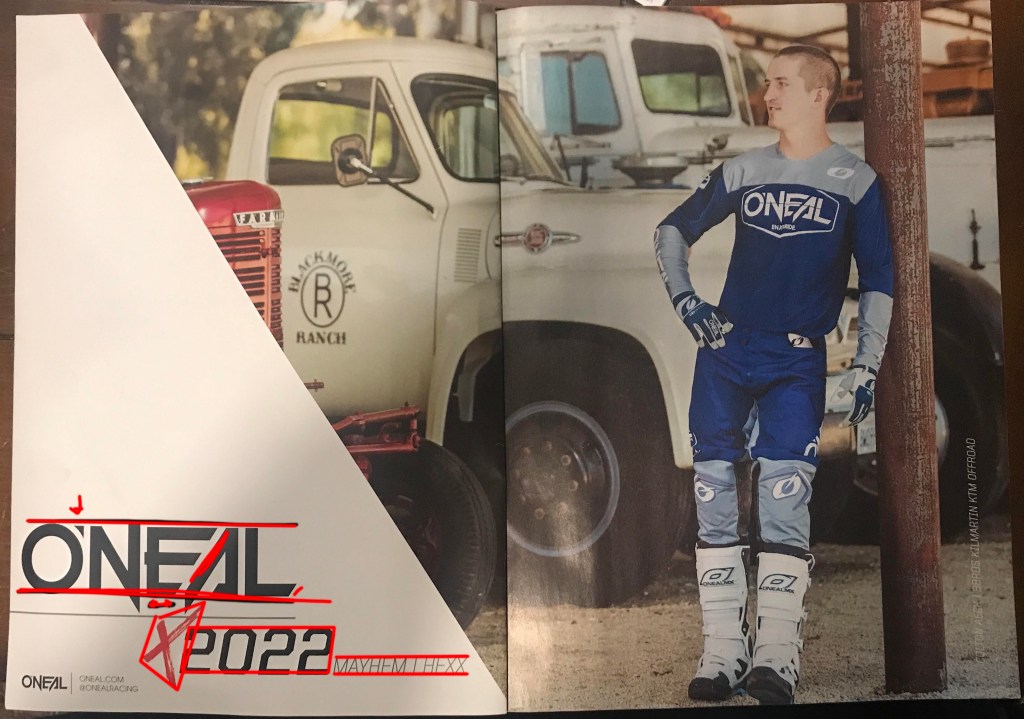
Contrast

The logo type is pointy and sharp. The angles are pointing is opposing direction. letter like N and A are breaking out of the line boundaries when normally they don’t.
In contrast, the sans fonts are mild and are there for information. They fit in their lines neatly.
Photo Design

The photographer uses rule of thirds to show what important. The man is on the left vertical third line. The intersect point at the top left is right on the chest logo, the biggest logo on the gear.
the photographer also uses some depth of field to make the background a bit blurry so our focus is on the outfit and gear.
My photo

My photo uses rule of thirds to place the subject on the left most vertical line. The top left intersect of the lines points to his chest to show off his jacket.
I used a shallow depth of field to get my subject in focus while blurring the back ground. the difference in light helps my subject stand out as well.
Final Thoughts
The contrasting type face help tell the viewer whats most important. The logos type is kind of wild showing off the sport of motocross being dangerous and exciting. The sans serif type is safer and easier to read which tell viewers that this is some of the boring stuff but still useful to find the product.
The photo is taken is such a way to every element is make the viewers eye point to the chest and down the subject to show off the gear.
