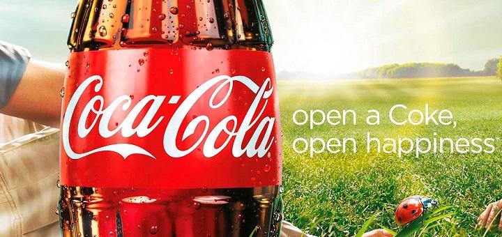

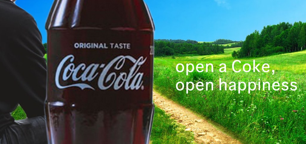
Coca-Cola Original Ad

Design (C.R.A.P.)
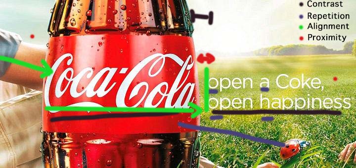
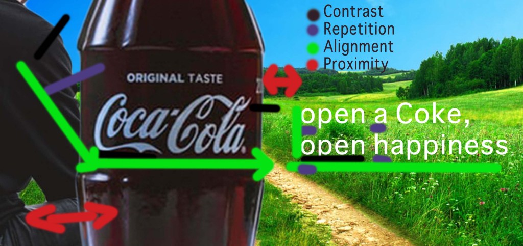
Contrast: The Colors of the Grass and bottle are contrasting colors, as well as the typefaces, one being decorative and the other sans serif
Repetition: The color red is repeated with the bottle, the lady bug and a bit of the arm. Lower case letter are repeated in the type except for the product.
Alignment: The arm leads to the bottle and the logo leads to the type. The type is aligned left with the bottle and the type and logo align on the bottom.
Proximity: The text is close to the logo but separated enough that you know they are different. The man is very close to the bottle, overlapping even, demonstrating a close relationship with the man and drinking Coke.
Color
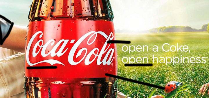
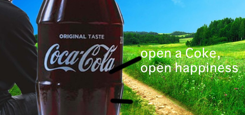
The white of the logo is used with the type and the sky. The red is used a few times to resonate with the Coca-Cola colors. The biggest cool color is the blue on the sleeve adding some contrast on the man.
Type
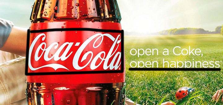
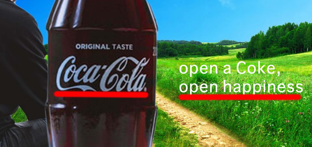
The logo is a decorative style cursive font. To contrast and help with readability, a sans-serif font is used. The text is mostly lowercase showing relaxation.
My New Ad
Design (C.R.A.P.)
Contrast: The colors contrast from the bottle and the grass. The type contrasts in style. the person contrasts from the background.
Repetition: The darker colors of the bottle and person repeat. The lower case of the body repeats except for the product name.
Alignment: The arm leads to the bottle, the logo on the bottle leads to the text. The text aligns left with the bottle and bottom with the logo.
Proximity: The bottle over laps the man showing a special relationship. the text is far enough away from the bottle and logo that they are separate.
Color
The red form the coke and the green of the grass compliment each other and let the bottle stand out. The white on the logo is repeated with the text.
Type
The logo used a decorative style script font to draw attention and stand out. The body copy is a Sans-Serif font to improve readability and contrast from the logo.
Conclusion
I used many different design elements to replicate the feel of the original ad. The point of the ad is drinking coke makes you happy. the bright and warm colors and minimalist text are used to show that feeling.
