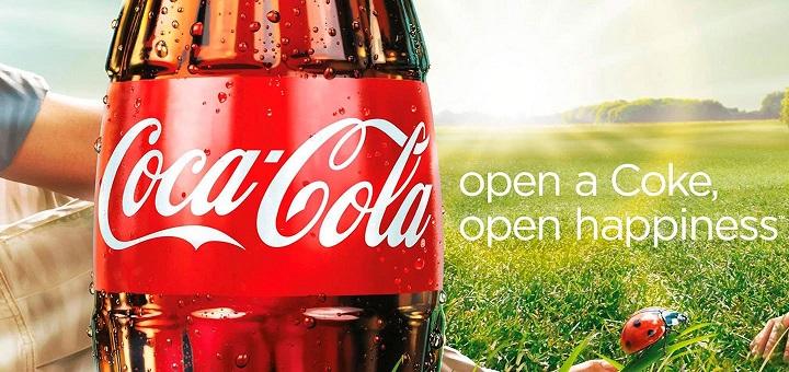
Coca-Cola Original Ad Design (C.R.A.P.) Contrast: The Colors of the Grass and bottle are contrasting colors, as well as the typefaces, one being decorative and the other sans serifRepetition: The color red is repeated with the bottle, the lady bug and a bit of the arm. Lower case letter are repeated in the type exceptContinue reading “Coca-Cola Design Analysis”
-
Subscribe
Subscribed
Already have a WordPress.com account? Log in now.
