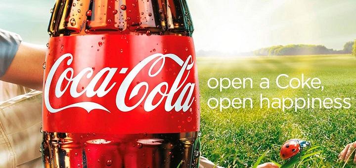
Coca-Cola Original Ad Design (C.R.A.P.) Contrast: The Colors of the Grass and bottle are contrasting colors, as well as the typefaces, one being decorative and the other sans serifRepetition: The color red is repeated with the bottle, the lady bug and a bit of the arm. Lower case letter are repeated in the type exceptContinue reading “Coca-Cola Design Analysis”
Tag Archives: type
Analyzing O’Neal Double Page Spread
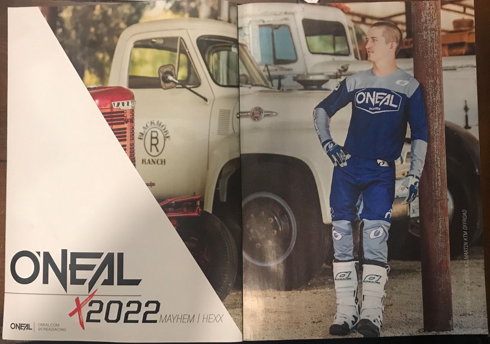
An O’Neal advertisement for motocross equipment. From Motocross Action magazine, November 2021. Picture taken by Colton Aeck.The design is simple and shows off the look or “coolness” factor of buying and wear gear from O’Neal. Type Face The type here is in two styles. The bigger type, the logo, seems to be a decorative style.Continue reading “Analyzing O’Neal Double Page Spread”
